For this project I feel that the best presentation method would be an exhibition of 21 images, ten images from each location along with a transition image, in the style of Richard Mosse’s Deutsche Börse Photography Prize 2014 display at The Photographer’s Gallery in London, in which he presented large scale high gloss prints in a spacious white room. I would not let the artist know where the images are from exactly to try and create more of an observation on man’s influence on nature rather than a comment on this and I feel that making the places anonymous would prevent people’s preconceptions of these spaces from impacting their experience within the exhibition.
I would also like to create a photobook to go along as a sort of exhibition guide (like Miren Pastor’s ‘Bidean‘), however, due to time constraints I will not have the book printed in time for the deadline of this project so I have created a PDF version of this which can be seen below. The photobook is something that I am extremely interested in and I feel that it was a great way to make a more permanent version of this project, with ten more images than in the exhibition, and to show my work in different formats. I tried to emulate the style of Paul Gaffney’s ‘We Make The Path By Walking’ photobook when designing by layout, along with using only a small amount of text. Although the text is at the beginning of the book instead, I feel that it works better there for my project as it gives the reader a small amount of context which I think is needed to portray my concept in a more consolidated way rather than making it completely open for interpretation.
Text for both the Exhibition and the Photobook
When writing the text for both of these formats I wanted to try and create a concise and coherent introduction that was not too long, as to not bore the reader before they have seen the first image, while still having enough text to give them the context that is needed for them to understand my concept.
“A Garden City is an urban residential landscape designed and built with a prominent amount of public green space and an emphasis on sustainability. These constructed areas in which man forms nature to benefit both the environment and its inhabitants are the basis for this series of photographs – a documentation of a journey through a constructed environment and a suburban park.”
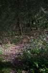
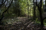
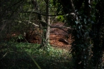
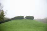
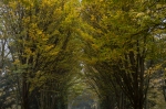
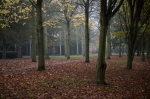
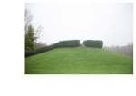
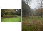
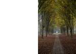
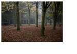
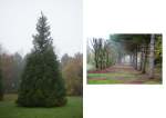
Final Exhibition Images
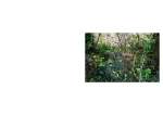
These are the final 21 images that I have chosen for the exhibition;


Exhibition Plan
I created an exhibition plan to show how I would lay my prints out and how I would light the space along with the seating that I would like to have within the room.  It looks as if the images are quite close together, however, the room would be incredibly large and there would be a gap of around 6 feet between each image to give a really spacious feel to the room and create the sense of being free as if you were in the environments from within the frames. I believe that this has allowed me to gain a better understanding of how to create an exhibition while trying to show my concept.
Sample Printing and Framing
As I would not have been able to print and frame the images the way I would have liked to, I created a couple of sample prints on a much smaller scale to show how my work would be presented. The images below do not give the prints justice at all, but I just wanted to show how the images would be framed and printed. I do not like the gloss frames on such small images, however, on an 8ft x 6ft print I believe that it would work well, especially as the print would be extremely high gloss due to using digital c-type fuji-flex paper; which adds a sort of iridescence to the images along with making the colours, blacks and whites pop due to the high contrast used. The image to the right would not be used in the exhibition but would instead be the cover of the photobook, I just wanted to print it to show how different the prints would look depending on the image. 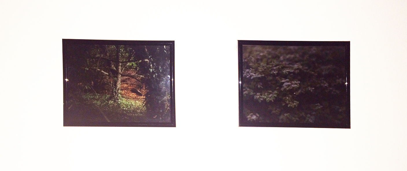 Photobook
I have ordered the Photobook, however, it will not be here in time so I have created a digital version to enable the viewer to see what it would like if it was printed. I have chosen order online, instead of hand make it like I usually would, due to financial and time issues and because of the amount of pages I chose to bind it using the perfect bound method as I felt that it was the most effective style for the final piece.
-

- Cover Image


-

- End Page
I am happy with my final work as I feel that both presentation methods work well with the images that I have selected, along with the flow of the images due to time consuming sequencing and layout planning. I also think that these two presentation methods work really well hand in hand as the exhibition gives you a taste of what the project is about and then the photobook gives you a broader view of it along with eleven more images including the cover image. This is how I feel was the best way to present the images because you get a broad overview and then you go in closer; which is how I navigated these environments when I was photographing them, so this emulates both the concept and the actual shooting method which I feel helps to consolidate the whole project as one final piece.
